
How to write a homepage that converts starts with one simple idea: your homepage cannot do everything at once. Most small business homepages try to explain the company, list every service, build trust, answer questions, show personality, and ask for action all in the same breath. That usually creates confusion instead of conversions.
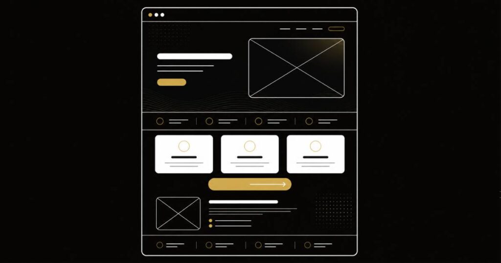
A homepage that converts is not built around clever copy. It is built around clarity. Each section has one job. Each word earns its place. The whole page guides the visitor toward one obvious next step. These eight proven steps show what to put on your homepage, how to organize the message, and how to make the page easier for real customers to understand.
6 minute read · Published by Buzz Clique Team
How to Write a Homepage That Converts: Quick Answer
A homepage that converts needs a clear hero section, trust signals near the top, a plain-English explanation of what you do, a short list of who you help, a simple reason to choose you, one primary call to action, a low-friction explanation of what happens next, and a layout that makes the message easy to scan on mobile and desktop.
The biggest mistake is trying to make the homepage sound impressive instead of useful. Strong homepage copywriting for small business should answer the visitor’s real questions: Am I in the right place? Can this business help me? Why should I trust them? What should I do now?
1. Start With a Hero Section That Says Something Useful
The hero section is the first screen a visitor sees. In a few seconds, it needs to communicate what the business does, who it helps, why the visitor should care, and what to do next.
Most weak homepages lead with vague lines like “Excellence in Every Detail,” “Your Trusted Partner,” or “Solutions Built for You.” Those phrases sound polished, but they do not tell the visitor enough. A useful hero section is specific.
Weak hero copy: Helping businesses succeed with innovative solutions.
Better hero copy: Clear websites, SEO, and Google Ads support for small businesses that need more qualified leads.
A good hero section should usually include:
- A clear headline that says what you do
- A short supporting line that explains who it is for or what result it creates
- One primary call to action
- A secondary link only if it genuinely helps
- A visual that supports the message instead of distracting from it
If your current hero section could describe any competitor with no changes, it is probably too generic.
2. Put Trust Signals Near the Top
Visitors decide quickly whether a business feels credible. Trust signals near the top help reduce doubt before the visitor gets deeper into the page.
Trust signals do not need to be loud or oversized. They just need to feel real. Depending on the business, that may include reviews, testimonials, client logos, years in business, certifications, completed projects, before-and-after examples, guarantees, or a short credibility statement.
Nielsen Norman Group’s homepage design guidance explains that effective homepages should communicate purpose clearly and prompt users to take action. Trust signals support that by helping visitors feel safer taking the next step.
What to write: use specific proof instead of generic claims. “Trusted by local homeowners since 2012” is stronger than “Your trusted local experts.” “Over 300 small business websites supported” is stronger than “We care about our clients.”
If you have reviews, keep them short. A single believable sentence can often do more than a long testimonial block that nobody reads.
If your current homepage does not pass these first two checks, it may be worth getting a second opinion before rewriting the entire site.
3. Show What You Do in Plain English
A website homepage that converts visitors should make the business easy to understand. After the hero and trust section, explain your main services or offers clearly.
For many small businesses, three to five service summaries are enough. Each service should explain what it is, who it helps, and what outcome it supports. Avoid cramming every detail onto the homepage. The homepage should summarize and guide people deeper, not replace every service page.
For each service, try to answer:
- What is this service?
- Who is it for?
- What problem does it solve?
- What result can the visitor expect?
- Where should the visitor go to learn more?
Weak version: We provide digital solutions for growing companies.
Better version: We build small business websites that explain your services clearly, look professional on mobile, and make it easier for visitors to contact you.
Plain English does not make your business sound less professional. It makes the page easier to understand, which is the whole point.
4. Give a Brief, Honest Reason to Choose You
Your homepage needs a “why us” section, but it should not turn into a long bragging block. The strongest reasons to choose a business are usually specific, practical, and easy to believe.
Good differentiators might include:
- The type of customer you specialize in
- Your process or communication style
- What is included that competitors often charge extra for
- How quickly you respond
- A low-risk first step, free review, or clear estimate process
- Experience with a specific industry, location, or problem
Two or three real reasons are better than a long list of generic claims. Specifics build trust. Generalities make visitors wonder what you are really saying.
Google’s guidance on helpful, people-first content is a useful reminder here. Content should be created to help people first. On a homepage, that means writing for the visitor’s decision process, not just filling space with claims that sound good to the business.
5. Pick One Primary Call to Action
This is one of the most important small business homepage tips: pick one main action you want visitors to take. Then make that action obvious throughout the page.
The primary call to action might be:
- Get a Free Review
- Request a Quote
- Schedule a Call
- Book an Appointment
- Call Now
- View Our Services
Other links can still exist, but the main call to action should be easy to spot. Use it in the hero section, repeat it naturally in the middle of the page, and close with it near the bottom.
Do not make people guess. If the visitor is interested but the next step is unclear, many will do nothing.
6. Show What Happens Next
Friction kills conversions. A short “what happens next” section can reduce hesitation because it tells visitors what they are agreeing to when they click, call, or submit a form.
This section works especially well for service businesses. It can be as simple as three or four steps:
- You request a review or consultation
- We look at your website, goals, or current setup
- We explain what is working and what needs attention
- You decide the next step with no pressure
The goal is not to overexplain the process. The goal is to make the next step feel safe, simple, and clear.
7. End With a Clear Trust-Based Close
The bottom of the homepage should not simply stop. It should close the loop. After explaining what you do, why it matters, and how the process works, the final section should make one more clear ask.
A strong homepage close might include a short reminder of the result, one final trust point, and the same primary call to action used earlier.
Example: If your website is not clearly explaining your business or helping visitors take action, we can review what is working, what is missing, and what should be improved first.
Then repeat the main button. Do not introduce three new choices at the end. The close should make the next step easier, not harder.
8. Make the Design Support the Copy
Even the best homepage copy can underperform inside a cluttered or slow design. Layout, hierarchy, spacing, mobile usability, and page speed all affect whether the words are actually read.
The design should make the message easier to follow. Important headings should stand out. Buttons should be easy to find. Sections should have enough breathing room. Mobile visitors should not have to pinch, zoom, hunt, or scroll through oversized blocks before understanding what you do.
If your website design and copy are both due for attention, doing them together usually works better than treating them as separate projects. A strong layout helps the copy breathe. Strong copy gives the design a clearer job.
A Practical Homepage Order That Works
If you are trying to figure out what to put on your homepage, start with this structure:
- Hero: what you do, who you help, and the main next step
- Trust strip: reviews, proof, experience, or credibility
- Services: three to five clear service summaries
- Why choose us: two or three specific differentiators
- CTA section: one focused action repeated clearly
- What happens next: simple process steps
- Final close: trust reminder and primary CTA
- Design check: spacing, hierarchy, speed, and mobile clarity
This is not the only homepage structure that works, but it is a strong starting point for many small businesses. The details can change by industry, but the principle stays the same: clarity first, then proof, then action.
A homepage that converts should include a clear hero section, trust signals, service summaries, reasons to choose the business, one primary call to action, a simple explanation of what happens next, a trust-based close, and a design layout that makes the message easy to scan.
Homepage copy should be long enough to explain the business clearly but not so long that it becomes hard to scan. Most small business homepages need short sections, clear headings, and enough detail to build trust and guide action.
The homepage can summarize multiple services, but it should still have one main conversion goal. If one offer is most important, make that the primary path and let other services support the broader structure.
The most important part is the hero section. It should quickly explain what you do, who you help, why it matters, and what the visitor should do next.
AI can help create drafts and options, but strong homepage copy still needs strategy. The business needs to define the audience, offer, proof, tone, and main call to action before AI can produce useful copy.
Get a Homepage That Actually Pulls Its Weight
A homepage is not just a brochure. It is a working part of your business. It should help the right people quickly understand what you do, trust your company, and take the next step.
Our AI-assisted content and copywriting work helps small businesses turn scattered homepage ideas into clear, structured copy that supports real conversions — clear hero, useful proof, plain-English services, focused CTA, and no fluff.
If you want to know whether your homepage is helping or holding people back, we are happy to take an honest look at what you have first.
Found this useful? Pass it on.